How Do You Pick Complementary Colors and Styles for Living Rooms?

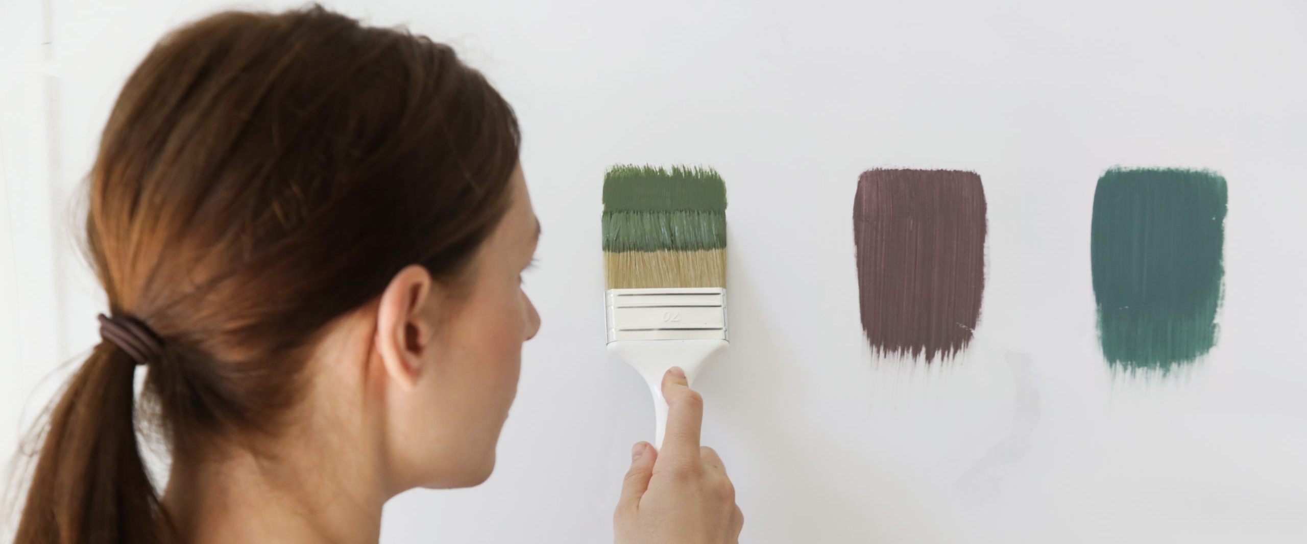
Consider this intriguing fact—research has suggested that colors in interior design can also help guide moods in humans. Like a chameleon adapting its hue to environmental conditions, blending different colors into your living space could positively influence one’s psychology.

With this guide, you can focus on selecting complementary colors and styles for a more harmonious ambiance within your space.

What Are Complementary Colors and Styles?

Complementary colors are any two hues positioned directly opposite each other on the color wheel. They naturally balance each other out when placed next to or simultaneously used in a color scheme because their combined effect is pleasing to the eye due to their contrasting nature.

How To Pick Complementary Colors For Your Living Room

Here is a guide on how to implement complementary colors to the interior design of your living room:

1. Understand The Color Wheel

Mastering the art of choosing complementary colors begins with understanding the color wheel. Primary colors—red, blue, and yellow—form the basis of all other hues. Combine these primary colors, and you get secondary colors like green, orange, and purple. Tertiary colors are derived from a mixture of primary and secondary hues. Complementary colors are opposite, creating a stark visual contrast and enhancing each other’s vibrancy when paired.

2. Determine The Dominant Color

Deciphering your dominant color for the living room is a vital first step toward crafting your ideal color scheme. Whether you have a penchant for deep navy blue or are more inclined toward a cheerful, sunny yellow, this foundation shade sets the mood of the space. Your individual aesthetics and personal style preferences can influence this primary color. It largely goes on to mark significant areas like walls or large furniture, creating an impact as soon as one enters.

3. Choosing The Complementary Hue

After determining the dominant hue, finding its best complement takes center stage. For instance, if your selected dominant color has cool undertones such as tranquil blue-green, its complement on the color wheel would lie in the warm-toned category—think about renditions of red-orange shades. Incorporating this complementary hue will bring balance and depth to make your primary choice stand out elegantly.

4. Consider Brightness and Saturation

When selecting your living room color scheme, paying attention to the color itself and the brightness and saturation is vital. Brightness refers to how light or dark the color is, while saturation refers to the intensity of the color. Using bright, saturated colors can cause visual overload, so consider tempering a dominant vibrant hue with complementing colors that are less intense to create balance.

5. Understand Neutral Colors

Remember that neutral colors help complement bright colors and darker hues – think whites, pastels, and different undertones of gray. A well-employed neutral color palette allows other design elements in the room to stand out without being overwhelming. It’s like minimalist art, in a way.

6. Consider Monochromatic Designs

Monochromatic designs can work wonderfully for those who prefer something simpler but still sophisticated. This color choice employs tints (lighter shades) and shades (darker hues) within a single color family. Use it to create a cohesive look throughout different dining or family rooms.

How To Select Complementary Styles For Your Living Room

Here are tips on how to choose complementary styles for your living space:

1. Create Contrast Through Textures and Materials

When selecting complementary styles for your home design, remembering different textiles can also contribute to a cohesive look. For instance, a soft velvet sofa pairs well with rough textures like a jute area rug or an industrial coffee table. The contrast between these elements creates visual interest.

2. Maintain Consistency in Your Theme

In interior design, consistency isn’t just about repetition but harmonious unity. This balance becomes apparent when you maintain a consistent theme in your living room. The theme can be minimalist, influenced by simplistic beauty, classic for an air of timeless elegance, farmhouse-inspired for a rustic charm, or modern with streamlined aesthetics.

By adhering closely to your selected style and ensuring it threads through every little element of the room, you are weaving disparate elements into one beautiful tapestry uniquely reflective of you and effortlessly harmonious at its core.

3. Add Accent Styles

Accent styles further enhance and bind together the overall theme. This could be achieved by incorporating accent walls painted in different colors from the rest of the room, using window treatments that match wall color or pop of color through accessories like lampshades and matching upholstery tones.

4. Highlight Characteristic Pieces

Every living room has its standout pieces—a distinct coffee table, a family heirloom, or a beloved piece of art. For instance, it could be an antique dining table in your family for generations; instead of trying to blend it into the background, let it shine against light-colored walls. Balancing heavier furniture with lighter elements can be especially effective in small spaces. Highlighting these characteristic pieces creates an interesting visual focal point that adds depth to your interior design while making a solid personal statement.

Remember, at the end of the day, these rules are guidelines, so don’t hesitate to experiment until you achieve an arrangement for your space that looks good and reflects your personality.